1/13/2009
3/13/2007
Already Cheating Time
A temporary hiatus has been taken from this blog to concentrate on my studio work, but I will return soon.
12/05/2006
WIND POWER: A Clean, Efficient, Sustainable Alternative

Our current president, although not the most reliable person when speaking in environmentally friendly terms, has stated that wind power can provide as much as 20% of the required electrity to our nation. The fact that this statement was even made signifies that wind energy technologies are at least being explored by the government and we can hope that the powers that be will accelerate the industries development.
Unfortunately, due to the shear density of urban areas, wind power is not feasible for meeting electrical needs but harnessing the wind can be especially beneficial in rural areas that are often far from the urban locations where their power is produced. If the price of turbines continues to drop and interest continues to increase they may become the most efficient way of powering rural areas, especially in the U.S. central planes where wind can be easily harvested. I think expanding suburban areas should also take more interest in the matter and plan ahead for their growing energy needs, establishing turbine farms on the still untouched farmlands outside their current city limits.
Amongst the most beneficial aspects of wind power are that it's turbines, one installed, produce no pollution or greenhouse gasses and use no natural resources. According to the American Wind Energy Association, more than 2400 megawatts of wind generation was installed in 2005 alone, enough to power 650,000 homes. There is no reason for this pace of installation to slow if people are educated of its benefits.
All in all, wind power seems to be of the most promising alternatives to nuclear power, burning coal and consuming massive quantities of oil in order to meet our nations electrical needs. Whereas the silicon in solar panels must be grown and can at times have a shortage in availability and hydroelectric power requires the water from our rivers, many of which are being sucked dry by overdevelopment, wind power requires the only wind, a resource I do not see us having a shortage of anytime soon. Finally, some might argue otherwise, but I believe wind farms are very attractive and in no way spoil the natural beauty of mountaintop ridges or the open plains and in some areas serve to make the landscape even more aesthetically pleasing.
12/04/2006
CONTAINER ARCHITECTURE
Excess shipping containers, primarily from China, are often abandoned in many coastal cities, left stacked stories high after their use. The containers need not, however, make up their own graveyards as they are still useful in many way, especially in the construction industry as more architects and designers are beginning to take advantage of the millions of containers abandoned in California and the UK alone. I first fell in love with the idea of shipping container construction when I saw Shigeru Ban's Nomadic Museum. It is a temporary warehouse type exhibit space with fabric pulled between container spaces that allows filtered light to fill the large cooridor during the day and give the buildings facade rows of glowing rectangles when the interior is lit at night.

Reuse of such a widely produced product can be very cost efficient when considering construction and manufacturing costs of most materials and the fact that container sizes follow international standards makes them applicable as construction elements in any area of the world. It is this modular aspect of the containers is what makes them so appealing.
As with any product that seems too good to be true, shipping containers have their downfalls. While any double length container would be plenty of floor space for a room, about 320 sf, I question whether the 8' standard width of the containers ever hinder the comfort of the inhabitants, and that is a before insulation measurement. That said, my next concern is the fact that these boxes, metal boxes, can by no means be enery efficient unless coated in interior insulation and given some special treatments on the exterior so that they do not act like heat sponges on a summer day. Porosity also seems to be a factor due to the fact that opening the sides of a container means the designer needs to the deal with the corrugated form of the containers, which is why I imagine nearly every window I have seen on these containers is at one end or the other.
Although I currently see many difficulties facing shipping container construction in climates where temperature changes are a daily fact of life (i.e. not SoCal) their reuse is a step in the right direction towards sustaining our future and making the most of what we have laying abandoned in front of us. Continued experimentation with the excess containers will no doubt yield an innovative and practical alternative in the future.
Some architects and firms who are experimenting with shipping containers:
Adam Kalkin
Peter de Maria
Urban Space Management
LOT-EK
Fox & Fowle Architects
STUDIO 804: House of the Year
I posted on Studio 804 in September and I simply wanted to bring them up again to congratulate them on their work for last springs modular house which has earned many accolades, the most recent being the House of the Year designation in Architecture Magazine. I attend the University of Kansas, the home of the non-profit STUDIO 804 design/build class and am proud to be friends with some of these amazing designers. Good work guys.
11/14/2006
Sustainable Thoughts: On Blogging and our World
As if windmills aren't already beautiful enough.
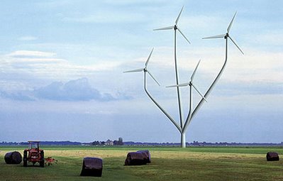
My direction with this blog has been leaning towards sustainability lately, and although I plan to incorporate architecture into as many post as possible, I will also be posting a few things on the subject of sustainability because I have recently begun to sense the impact that we, especially as architects, can have upon the future of our world and health. School's winding down and that means that I will be getting to all the subjects I've been neglecting lately, as if anyone even reads this blog, atleast there isn't anyone I know of...YET. I'll just keep telling myself that pretty photos will draw people in.
Read this 8-week series of articles about sustainability from Slate.com, the Slate Green Challenge. It gives an overview on different aspects of sustainability with basic facts and simple suggestions on how to live a more sustainable life.
Most of you might think that this whole sustainability shtick is just environmentalist dogma, but much of the data is well founded and should be taken seriously. I know that the Kyoto Protocol and various other actions have been made to slow the amount of greenhouse gasses being released into the atmosphere, which I am concerned about, but the subject of sustainability is what interests me most. Our world-wide dependence on natural resources will only last so long. We might have ridiculous global warming a century from now and be much less affected by it than by the fact that many of our industries have halted due to the fact that we have not more oil, steel or even water left to be harvested on the planet. We must embark on a mission to find alternative, sustainable sources of energy because future generations will depend heavily on them. The answers will not be cheap and although sustainability has become somewhat of a buzzword there are plenty of people that have no knowledge of or interest in the movement.
Additional resources:
Treehugger TV --- especially an interview with Lester Brown, president of the Earth Policy Institute and author of the book Plan B 2.0
via Transstudio.com: Raw Material Time Horizons, Remaining Aluminum Stores, Global Oil Estimates,
check out my previous post VIDEOS: Sustainability
11/07/2006
VIDEOS: Sustainability
Any good internet user is well aware of the power YouTube. By way of the blog Jetson Green I first saw a portion of a Tim Russert interview with Tom Friedman, recent author of the book The World is Flat and a favorite contributor of mine to the NY Times. Friedman expresses his concern over sustainability, our international dependence on oil, and the role the U.S. must play in the future in order to remain as influential as countries such as China and India.
Another wonderful series to check out on YouTube (unless you prefer to order it on DVD) is design: e2, a six episode production by PBS that is narrated by Brad Pitt, who of recent has been a leading proponent of sustainable architecture. I should also mention that further analsis on the same design: e2 issues are avaivable through podcasts.
Another wonderful series to check out on YouTube (unless you prefer to order it on DVD) is design: e2, a six episode production by PBS that is narrated by Brad Pitt, who of recent has been a leading proponent of sustainable architecture. I should also mention that further analsis on the same design: e2 issues are avaivable through podcasts.

11/06/2006
BOOKS: Worldchanging: A User's Guide for the 21st Century

I've been frequent reader of the website Worldchanging for some time and am very excited to have recently purchased their book Worldchanging: A User's Guide for the 21st Century. Not only did I judge this book by its cover, the cover's graphic design is gorgeous, but I just dove into the Shelter portion of the book and am already impressed by the breadth of material presented with such clarity. This section of the text is written largely by Sarah Rich and her Inhabitat companion Jill Fehrenbacher. By the way, if you haven't yet checked out Inhabitat, I highly recommend it, it's a well organized, inspiring and resourceful blog that I read religiously. The other sections in the manual deal with Cities, Community, Business, Stuff, Politics and Planet, all on a global scale and with the intent of educating the public on how to intelligently budget our resources and create sustainable living situations regardless of location.
When I get more into the 600 page Worldchanging book (I just started reading it today) I'll post the fascinating topics.
10/29/2006
Interlam MDF
The most affordable solutions to building are not usually the most attractive and this is surely true when it come to medium-density fiberboard (MDF). But as MDF is increasingly made with more sustainable materials including scrap woods, recycled papers, bamboo, and even steel and glass it is becoming a smarter choice in sustainable building. Now how do we deal with the aesthetic dilemna?
 The company Interlam has been developing a series of architectural MDF panels using computer-guided router cutting technology to carve and sculpt numerous forms into their surfaces and they already have fifty-some to choose from. Only upon close inspection does one realize that these are the dreaded MDF panels and even then the patterned surfaces make one doubt their realization. I think they are very attractive (even though I haven't seen them in person) and some of the patterns, although a bit zany at times, could be the perfect accent to a particular style of design.
 So even though MDF remains a bit of a faux pas in the design realm at least we have someone working on enlivening its materiality. In the end its cost, strength, workability and prospect for sustainablity are hard to match in other materials, especially woods, and its not a product that will be going away any time soon in our industry of rapid construction.
 The company Interlam has been developing a series of architectural MDF panels using computer-guided router cutting technology to carve and sculpt numerous forms into their surfaces and they already have fifty-some to choose from. Only upon close inspection does one realize that these are the dreaded MDF panels and even then the patterned surfaces make one doubt their realization. I think they are very attractive (even though I haven't seen them in person) and some of the patterns, although a bit zany at times, could be the perfect accent to a particular style of design.
 So even though MDF remains a bit of a faux pas in the design realm at least we have someone working on enlivening its materiality. In the end its cost, strength, workability and prospect for sustainablity are hard to match in other materials, especially woods, and its not a product that will be going away any time soon in our industry of rapid construction.
10/23/2006
Ornament in Architecture
"...I beg you in the interim to reflect that this godlike human body has no ornament."
One of my favorite quotes regarding ornament. In a letter to Ralph Waldo Emerson, Horatio Greenough here embodies the soul of the Transcendentalists movement and their ideal of organic beauty, nature as truth, and truth as beauty.
Modern Ornament?
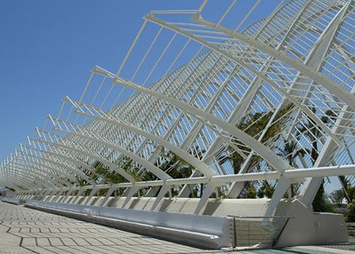
Here's a topic that can take up a bit more space than a single blog entry, atleast 200 years worth of philosophy and architectural history and it still goes much further back than that. The Temple of Hera II, for example, was a purely functional building with no ornament; a simple assembly hall meant to serve the needs of the local populance. The friezes of these Greek temples at Paestum, which one envisions covered with gods, goddesses and horses (am I wrong?), are not believed to have been ordained with their relief sculptures until years after their construction. Much in the same manner, medieval architecture was often "rebuilt" during the Renaissance with the only real change being a small expansion and widespread additional ornamentation.
Material Beauty as Ornament?
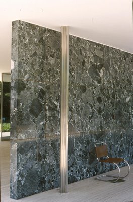
Now that we have well emerged from the era of Miesian Modernism we as architects have once again begun to explore the ornamental realm without being overwhelmingly criticized and the influx of digital technology gives us the opportunity to engineer just about anything we can visually imagine, just ask Libeskind or Gehry.
Functional Ornament?

But is it necessary to abandon traditionally rational structure just because we have the capability (though not always the finances)? It seems that more and more often I feel that the starchitects of our time have sold their souls for a place on the pedestal and brutalism has been revived with a more angular, curvilinear, and successful attitude than before. I see these sculptural forms as ornament in themselves. On the other hand, the interior of a building can be dressed in a luxurious manner by using high quality and often pricey materials and still have no ornament according to Loosian standards. I think our modern path in architecture places ornament on larger, very different scale than the detailing of Frank Lloyd Wright or that found in the Greek orders.
Ornament as Indigenous Identity?
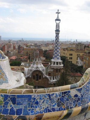
You might want to check out these links regarding the history of ornament and some modern discussions of what it now means.
Architectural Ornament history
The New Iconic Building? - Charles Jencks & Peter Eisenmen
podcast - "Architecture Parlante: The Grammar of Ornament and Crime and Punishment"
http://www.tyznik.com/ap/ap.rss (iTunes--"Advanced"--"Subscribe to Podcast"--then paste this link)
One of my favorite quotes regarding ornament. In a letter to Ralph Waldo Emerson, Horatio Greenough here embodies the soul of the Transcendentalists movement and their ideal of organic beauty, nature as truth, and truth as beauty.
Modern Ornament?

Here's a topic that can take up a bit more space than a single blog entry, atleast 200 years worth of philosophy and architectural history and it still goes much further back than that. The Temple of Hera II, for example, was a purely functional building with no ornament; a simple assembly hall meant to serve the needs of the local populance. The friezes of these Greek temples at Paestum, which one envisions covered with gods, goddesses and horses (am I wrong?), are not believed to have been ordained with their relief sculptures until years after their construction. Much in the same manner, medieval architecture was often "rebuilt" during the Renaissance with the only real change being a small expansion and widespread additional ornamentation.
Material Beauty as Ornament?

Now that we have well emerged from the era of Miesian Modernism we as architects have once again begun to explore the ornamental realm without being overwhelmingly criticized and the influx of digital technology gives us the opportunity to engineer just about anything we can visually imagine, just ask Libeskind or Gehry.
Functional Ornament?

But is it necessary to abandon traditionally rational structure just because we have the capability (though not always the finances)? It seems that more and more often I feel that the starchitects of our time have sold their souls for a place on the pedestal and brutalism has been revived with a more angular, curvilinear, and successful attitude than before. I see these sculptural forms as ornament in themselves. On the other hand, the interior of a building can be dressed in a luxurious manner by using high quality and often pricey materials and still have no ornament according to Loosian standards. I think our modern path in architecture places ornament on larger, very different scale than the detailing of Frank Lloyd Wright or that found in the Greek orders.
Ornament as Indigenous Identity?

You might want to check out these links regarding the history of ornament and some modern discussions of what it now means.
Architectural Ornament history
The New Iconic Building? - Charles Jencks & Peter Eisenmen
podcast - "Architecture Parlante: The Grammar of Ornament and Crime and Punishment"
http://www.tyznik.com/ap/ap.rss (iTunes--"Advanced"--"Subscribe to Podcast"--then paste this link)
10/19/2006
The Pace of Harvesting Energy
It pretty well known that energy can be neither created nor destroyed so why has it taken this long for us to attempt to harvest the energy used while performing a very basic task and the one we expend the most energy doing each day: walking. All those calories you consume on you lunch break could help power the lights you use when you get back to work.
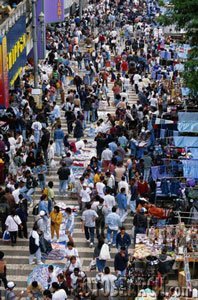 An article released in Wired this past summer tells us of the ambitious undertaking by some British engineers to harvest the energy released into the ground in heavily traveled urban areas. The idea is to contain the vibrations released into the ground by footsteps and use the energy to power street lights and possibly the lighting in building. The benefits of this invention seem endless in building sustainable cities because it depends on human movement and we can all admit to being creatures of habit within our urban environments. I bet most of you walk the exact same path to work every single day, I know I usually do.
read article: Powering Up, One Step at a Time
LV HOMES: by Rocio Romero
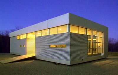
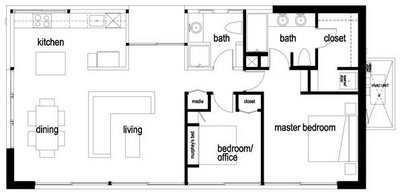
I find the new series of LV Homes by Rocio Romero as quite nice looking for their simple design and affordable pricing. The low-end LV kit starts at around $33,000 and can be upgraded in a number of ways including snowloading capacity, customized siding and a basement. The walls and ceiling of the basic kit have R-values of up to 50 and the minimalistic design makes for simply ventilated areas. The division of rooms in plan seems to work very well as to maximize the spaces within the 25'x49' (LV model) frame.
The downfall to these homes are the often high additional costs since they are really nothing more than prefab shells. Some things not included in the LV home purchase are electrical and plumbing installations, interior walling, flooring, cabinetry, lighting fixtures, water fixtures, appliances, windows and basic furnishings to the interior spaces. Depending on personal tastes, of course, I have heard estimates from $70,000 to $100,000 or more for these basic necesities which makes the jaw-dropping $33,000 original price tag seem a bit less enticing.
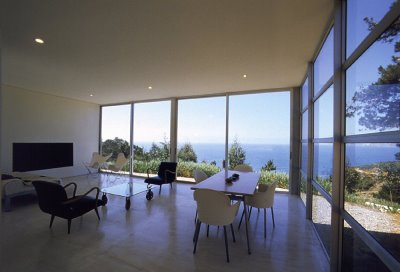
Above all the LV home is a step in the right direction for architects and designers continually trying to develop that ever out of reach affordable, sustainable, easily constructed home that could be further improved and produced on a large scale at some point. I look forward to seeing her future work.
10/11/2006
The Perfect $100,000 House

Today I attended a lecture by Karrie Jacobs about her new book The Perfect $100,000 House. Jacobs is a contributor to Metropolis magazine, The New York Times and most notably the founding editor of Dwell magazine. Although she abruptly left Dwell a short year after its conception it has grown rapidly since and I find it to be a great resource for prefab and modern architecture.
Her concept for the book is summed up pretty well in its title but here's a brief run down. She set out on a cross country road trip in 2003 talking to architects and contractors with interests in affordable housing to locate both realized and conceptual projects that cater to the economic needs of the everyday, middle-class American. In order to find the most efficient and affordable designs she pressed these builders to construct a house under the $100,000 cap and inquired about a houses true necessities. Often 10, 20 or even $30K could be subtracted from a houses overall cost without betraying its character and the architects style.
Jacobs visited with numerous architects and had time to mention only a few of which these stood out to me: Dan Rockhill/Studio 804 (whom I've already touted), Rocio Romero (whose LV homes I've been planning a post for), KRDB, Anderson Anderson, William Massie, Rural Studio and Brett Zamore. I've yet to thouroughly explore the websites of all these architects but I would suggest checking them out from the one or two projects I've seen from each.
10/09/2006
Designis Personae
This article, Designis Personae, from Metropolis magazine gave me a nice laugh tonight. It calls out the various individual stereotypes we find in any studio class and the jurors summoned to critique our efforts. I'm sure it will remind you of someone you know in class or even everyday life.
These were my favorites for juror and student, respectively:
THE BITTER-ENDER. This is the theory-head or other pan-flash ideologue unable to update his or her shtick, adopted a million years ago from some lapsing mentor or deceased guru. Begins all comments with “Peter used to say…” Some students are bedazzled. Most are unmoved. All who are not a close reflection of himself will be attacked. Those who are will get an unpaid internship on the spot.
THE LEAKER. The one who always loses it. He or she has been awake for three weeks. He or she has been totally misunderstood by his or her critic for six weeks. He or she has been dreaming things in his or her head that he or she is unable to draw on his or her piece of paper all of his or her immeasurably frustrating life. It’s not incompetence, but there are, shall we say, some issues with creativity. We see before us one half-scratched pencil drawing, one limp tissue-paper model, and a thousand perfect La Tourette monasteries locked inside. You’d cry too.
10/03/2006
For An Architecture Of Reality
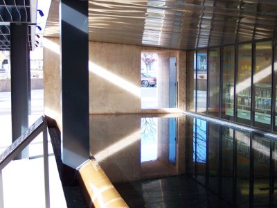
I finished reading Michael Benedikt's For An Architecture Of Reality today. It's a short, yet sweet interpretation of our postmodern path in architecture (as of 1984 when it was written) and what Benedikt believes to be the essence of an architecture rooted in reality. Upon experiencing a building one must feel its realness consciously and subconsciously, move with its movements and be drawn to areas of seeming emptiness without explanation. A "real" building is much easier to find than to create. They have been modestly constructed for centuries to serve a specific purpose in the most efficient manner possible while maintaining a certain dialogue with its antecedents. I am reminded of grain silos.
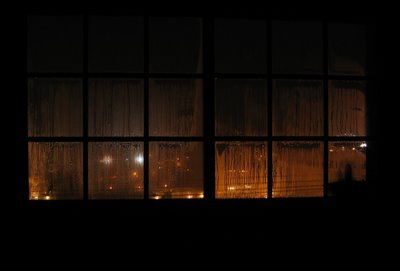
The "direct esthetic experience of the real" is how Benedikt defines the moments when a person sees this importance and beauty in any building or arbitrary aspect of nature, such as a single cow in a enormous pasture under a lonely tree (as illustrates a picture in the book), or in my example, the shimmering of dew drops on a spider's web at dawn. I think this moment of truth is what IS; it is not a metaphor or symbolic of some greater idea. Benedikt says, "Ideas and colors do not point to other realms, signs say what they have to a fall silent."
"Realness" is divided into four components: presence, significance, materiality and emptiness. Here is how I would define the four as described by Benedikt:
Presence: When a building has presence it presents itself much in same way that an actor can be said to have stage presence, simply being present on the stage does not mean a person embodies this sense of presence. The building is unashamedly aware of itself and assertively claims its territory.
Significance: A building gains significance by affecting the everyday lives of its user rather than representing some abstract idea or being symbolic of an idea. A renaissance bell tower informed citizens hourly of the time thus giving the tower significance. This is far from the intended significance of a Renaissance facade at the local library. A buildings significance is timely in the same way that the industrial revolution provided the necessary foundation for Modernist architecture and has since faded.
Materiality: This is most easily definable component which I can nearly sum up by saying: Honesty of materials. Clients have always desired more precious materials than they could afford which has led to the use of stone veneers far beyond the time when they were used as structural support. The authenticity of a material is also essential. One should be able to read a materials composition from afar and up close so they do not feel decieved by the building.
Emptiness: The best way to explain this concept is using Benedikt's example of the Japanese word Ma. "Ma is in the gaps between stepping stones, in the silence between the notes of music, in what is made when a door slides open." This emptiness is the inhabitable void in between well placed structural elements. It is an absence of short-term entertainment and distractions which too often clutter a space.
I see Benedikt's components in these photos:
Presence
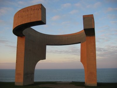
Presence: (Roman Aqueduct)
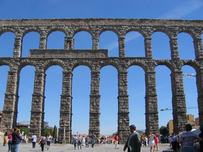
Significance: (St. James Cathedral)

Significance: (Galleria Vittorio Emanuele)
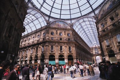
Materiality

Emptiness (Antoine Predock - Mesa Public Library)
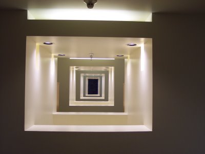
Emptiness: (Louis Kahn - Dacca)

10/01/2006
Sketches of Frank Gehry
Sketches such as these seem very arbitrary and almost childish to the naked eye, and maybe they are, but they are the initial inspirations for world renowned architect Frank Gehry. I just watched Sketches of Frank Gehry, a documentary about his path to stardom and the everyday objects and experimentation that has influenced his flamboyant style of architecture. As many of you already know he exploded onto the international architecture scene after the controversial construction of the Guggenheim Bilbao in 1997.
As an aspiring architect I was moved by the amount of time he and his collaborators spend model making. Too often I am caught up in the fast moving world of rendering a building using Sketch Up or 3D Studio Max when sitting down, costructing and picking apart a physical model can be greatly beneficial on a different level. I think that all students should re-evaluate the emphasis placed on computer modeling because it can be done in most firms by experts in computers. Model making, however, requires a different, more intuitive approach to designing and gives students an immediate, tangible grasp of space and scale. Frank Gehry supposedly doesn't even know how to use a computer.
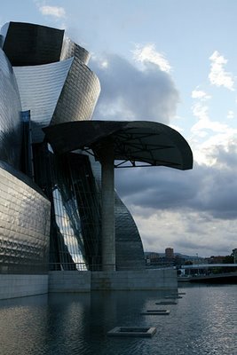
I visited the Guggenheim in Bilbao a little over a year ago and was shocked, appalled, amazed and speechless when I saw in person the building I had heard and read so much about. My initial thought was to call it a beautifully sculpted monstrosity, which I still believe it to be. The subtle ripples in the reflection pool on the river facing side of the museum playfully reflected off of the titanium clad structure in a mesmerizing fashion whereas other vast areas of this metal simply reflected the blinding sunlight into my eyes. The cavernous entrance allows light to creep directly and indirectly into every corner of the central interior atrium. The use of high technology is very obvious within this atrium space where every stone slab has been laser cut to give the walls a flowing sense of motion. It's seductively impractical and seems to come from some intuitive perfection which Gehry himself wouldn't even be able to explain. The gallery spaces were what most disappointed me. Many were temporarily closed and the ones open housed an exhibition on Latin American art primarily before European conquest. The galleries were too dark and did not lend themselves well to the subject matter (which might also have influence my opinion because the exhibits were not all that well organized or interesting). No discredit to Gehry but my favorite part of the whole experience was probably the enourmous Louise Bourgeois spider out back.
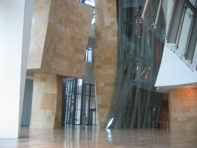

I can't say that I am a huge Gehry fan but I still respect his approach to architecture. All in all though, I would recommend his film to anyone interested design of any sort for it's artistic take on the profession and the creative processes behind his newest landmark buildings.
9/28/2006
Studio 804
I've been studying structural systems and approach to design/build architecture through a class taught by Dan Rockhill . He has an all-encompassing approach to design that moves from the tip of his pencil, through the construction process in his workshop and culminates in the erection of a building. He employs only a small handfull (6-7, I believe) of mostly B.F.A. students (he claims Arch. students are too flighty).
His most published work has been done with 5th year M.Arch students in Studio 804 which is a design/build instruction class. The goal of the class thus far has been to design and construct a local residence within the semester. Student are deeply involved in the process to the extent of talking to local constructors in order to understand building regulations to presenting proposals to the city in order to purchase the site where the residence will be constructed.
The most recent work by Studio 804 was completed in May. It was constructed in a warehouse in Lawrence, KS in six different sections then shipped to its site in Kansas City where the six elements were attached in a single day to form the whole. Here are some more photos:
9/27/2006
Rio Inspiration
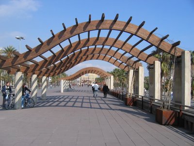
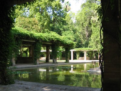
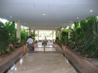
I am just starting a new project in my 3rd year of M.Arch at the University of Kansas, and no, it is not this blog. I will be designing a hotel next to the Copacabana Palace in Rio for the rest of the semester. It's larger project than I have ever attempted to tackle but I know I can produce something extraordinary in this amount of time. I will try to continue to keep ideas up to date as I dive into the design process, although sleep might beat out blogging, following school and work that is, at some points. So far I have decided to emphasize the lush environment Rio offers by installling a trellis system on the exterior walls of the building to encourage vine growth, after all the year round average temperature in Rio is 86/69 F. Here are a few photos of my initial inspirations:
